Today’s blog post is going to focus on composing photos on a flat surface. I’ll spend some time in a subsequent post talking about how to compose photos in a vertical space, but for today, we’re talking about how to take a better flatlay and other pictures that involve setting out your projects and props on a surface.
After you get the hang of understanding your lighting and taking corrective measures for tricky light situations, setting up the photo is your next step. This is where things really start getting creative.
I prefer to take most of my photos on a flat surface because it’s easier when I’m taking the photos myself. I have a very small business without a large profit margin, so I don’t have much room in the budget to hire a photographer to help me. When you take photos on a flat surface, that leaves your hands free to actually hold the camera.
There are a few tricks to making a photo on a flat surface more visually interesting. If you’ve ever tried to lay out a photo with a bunch of props in it, but it just looked like a bunch of props dumped into a photo, this is the post for you.
But first, a quick note: this post is one in a series of posts about ways to improve your knitting photography. Here are quick links to the other posts in the series.
Now, let’s get to it.
For a Better Flatlay, Start With a Simple, Smooth Background
The first thing to think about when you are laying out items for a photograph on a flat surface is to ensure that you have, well, a flat surface.
You can use a table top, your floor, your desk, a patio in your backyard, a large piece of cardboard spread out somewhere, or whatever you have on hand. I usually use my kitchen countertop, but I’ve been known to use my bed, my couch, and plenty of other spaces. The important part is that the surface needs to be flat.
That’s because the flat surface will give you more control over the placement of your objects. It’ll also help give a smooth, firm foundation to your image.
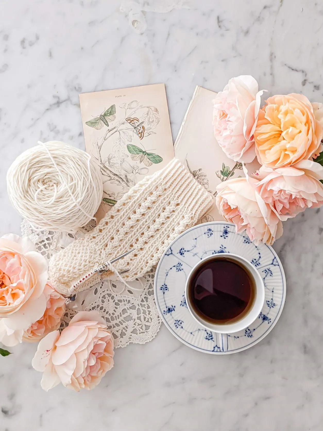
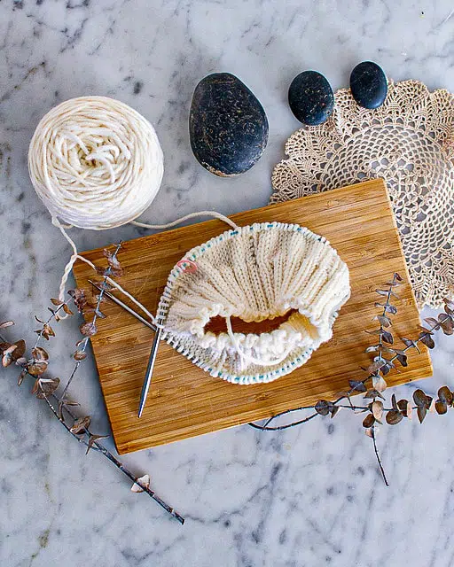
You also need to make sure that the background is simple. While it doesn’t have to be a completely solid color, it should be something that doesn’t distract too much from your knitting. I use my kitchen countertop because it’s made of white marble, which is a neutral surface even if it does have a little bit of texture from the veining.
You can also use a tablecloth, a plain wood background, a blanket, or anything else that is simple and not visually distracting.
One of the biggest mistakes I see people making when photographing their knits is that they put their knit item on something with a busy pattern or texture behind it, or something with a bright color that competes with the knits for attention. Don’t use things like patchwork quilts, colorful rugs, blankets with really intense texture, a lumpy bed, etc. You want your knitting to be what draws the eye.
Include Layers to Make Your Composition More Visually Interesting

The next step when composing your picture is to consider the different layers. This is a technique I learned from Emma Natter several years ago. She hosted an online webinar about styling flatlays, and the most important takeaway from it for me was this concept of having visual layers within your photograph.
You need at least three layers. That’s because if you just have your large flat surface and then all your small props scattered around on it, the small props won’t feel connected to each other. There are a few extremely talented photographers who can make that work, like Yoko at @atelierjuno on Instagram. Most of us, however, need another layer in there to add visual interest.
You’ll often see my photographs using doilies or antique botanical prints to fill in part of the background. These create an additional visual layer that helps concentrate the eye instead of letting the eye wander evenly across the entire photo. It also connects the various props to each other so their placement looks intentional. This layer helps people focus quickly on the part of the picture that is most important, that is, your knitting. That means you want to use the layer somewhere close to your focal point. When I do this, I often layer it directly under the knitting. Sometimes I will add another prop next to the knitting for balance.
One of my favorite Instagram creators, Dominique (@karayiib), uses this technique really effectively in a lot of her photos. As you scroll through her feed, pay attention to how she uses envelopes, books, pieces of paper, and textiles to create a third layer that helps concentrate the eye’s focus.
Play with Textures for a More Engaging Photo
If you really want to create a better flatlay, give some thought to the different textures you’re using.
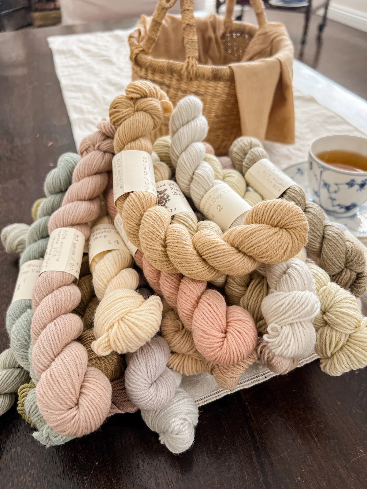
When I layer in props, I try to make sure to have a mix between hard and soft, shiny and dull, smooth and rough, and so on. I do a lot of my photos on my countertop, which is polished stone. As a result, I like to layer in softer accessories. I use paper or books, which are non-reflective. I also use soft flowers and textiles to balance out the hardness of the stone. More colorful props balance out the whiteness of the stone background. Having a mix of textures in your photos will help give more visual interest.
A great example of this is some of the flatlays by Gavriella Treminio (@hellogavriella on Instagram). As you scroll through her feed, notice how she uses a mix of hard wood, dried botanicals, silky smooth fabric, and textured yarn (both in the skein and worked up into knitted and crocheted fabrics) to give her images different textures. To take a better flatlay, give the eye something to engage with by mixing up the texture.
Use Multiple Categories of Props for a Better Flatlay that Engages the Eye

Photographs taken on a flat surface benefit from the addition of a few props to lend visual interest. There’s just one thing: you don’t want to use only one kind of prop. That gets kind of boring to look at.
So what I like to do is think about general categories of props. Mine tend to fall into several different categories. I use teacups and related dishware, antique textiles, vintage paper ephemera and books, flowers from my garden, and, of course, my knitting. It helps to have at least three different categories of props. Your props can do double duty for a better flatlay. For example, the antique textiles in my photograph also serve as a visual layer to add some depth to the photograph.
To decide on your own categories of props, you need to do a little introspection. Spend some time thinking about who you are, what you love, and what kind of aesthetic you want to cultivate. There are a lot of people who are using these principles but creating photographs that are very different from mine.
For example, take a look at some of the photographs on Jen Parroccini’s Instagram feed. She photographs some of her knits on a flat surface, too, but we use different items as props. It gives a different mood, a sense of originality, and an injection of the photographer’s personality into the image.
Odd Numbers Make for a More Interesting, Better Flatlay
The human brain loves odd numbers in visuals. That’s part of why I recommend using at least three categories of props. Beyond that, though, you should use your props and layers in odd numbers, too.
For example, when I use flowers, I try to put them in clusters of odd numbers. There may be two clusters of flowers, but within each of those clusters, there will be three or five flowers. This is a more visually engaging layout. Sometimes, I will mix flowers, for example tucking cosmos in with a bunch of roses. When I do that, I try to have an odd number of each kind of flower.
This isn’t a hard and fast rule, of course. You’ll often see me using two books or two clusters of flowers. Until you get comfortable breaking the rules because you understand them deeply, though, it’s worth trying to stick with the safer arrangement strategy. The path toward a better flatlay starts with understanding the basic rules before you intentionally break them.
A Video Example to Study
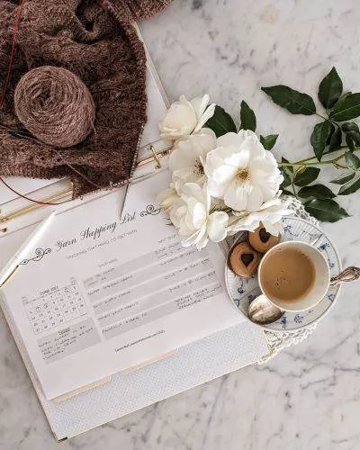
Take a look at the photo at the top of this post again. Wanna see how I set that up? Spoiler alert: it took less than 60 seconds. Here’s a video of how I laid out all my items for that photograph. Notice how I start with the flat layers, then add the main focal point, then embellish with other props. Now it’s your turn to try!
More Resources
Here are some additional resources on flatlay photographs to help you improve your skills.
Miranda Balogh covers flatlay photographs for artists (lots of overlap for knitters!).
Christina Greve, one of my favorite lifestyle photographers, shares some of her top tips for better flatlays.
Here’s a great general overview of product photography with tips that can improve your flatlays, too.
Let’s stay connected!
Join my newsletter for 30% off all new releases, regular updates with helpful tips and tricks, first crack at registration for upcoming workshops, exclusive discounts, and more.
Join the A Bee In The Bonnet Facebook Group to participate in knitalongs and other fun community events
Come hang out with me on the A Bee In The Bonnet TikTok
Follow along on the A Bee In The Bonnet Instagram
Get inspired via the A Bee In The Bonnet Pinterest


Lauren, this was so interesting to read! And a lot of beautiful accounts to follow and take inspiration! Thank you!
I’m so glad you enjoyed it! Instagram is full of so many talented photographers using the same basic strategies in wildly creative ways. It’s an endless source of inspiration.
Thanks for a great article. Very helpful. Like you, I am not a photographer and making pictures is the hardest part of my knitting design business.
I’m so glad you found it helpful! I enjoy the photography part but definitely do not have formal training and have mostly learned through trial and error (and reading a lot of blogs!).
Thank you for this very interesting article and the additional links. My photos are dismal but with a little direction from your article I might improve.
I hope it’s helpful for you! Learning to take good photos is a lot like building muscle–the only way to really do it is through lots of repetition.
Thank you for this. I came across it by chance and didn’t even know what I didn’t know. Props, layers… Really useful tips.